La Red del Cambio

Designing a sustainability
platform for Wallapop

WEB DESIGN - ART DIRECTION - EDITORIAL SYSTEM
Client
Wallapop
 
Rol
Art Direction
Web Design
Information Architecture
 
Corporate Director
Patricia Meso

Account Executive
Clara Huertas
 
Web Development & Implementation
Bcn Apps


Tools
Figma
Wallapop is one of the most widely used marketplaces for reused products in Southern Europe. Millions of people use the platform every month to give objects a second life, which places circular consumption at the center of its business model.

As the company’s sustainability work grew, Wallapop needed a dedicated space where all this information could live together. The existing website for La Red del Cambio (The Change Network) was originally created to publish the results of an annual study, but the ambition for the new platform was much broader.

The goal of this project was to design a website that could explain Wallapop’s sustainability approach in a clear and engaging way, while also serving as a long-term repository for research, reports and initiatives related to circular consumption.

The result is a digital space where editorial clarity, visual storytelling and structured information work together to make complex content easier to navigate.

The platform had to speak to very different audiences at the same time: users of the app, employees, journalists, partners and institutions interested in sustainability data.

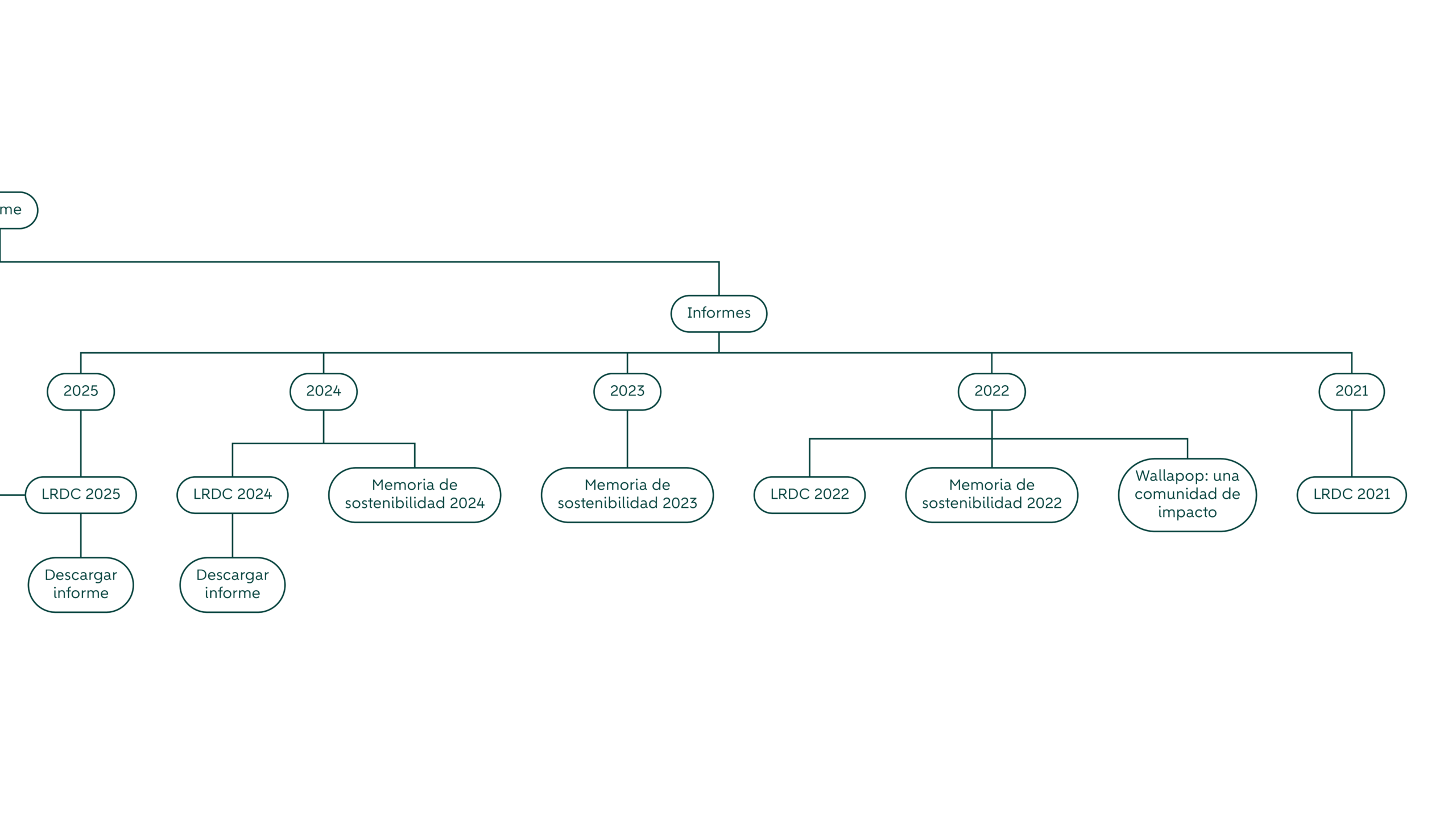
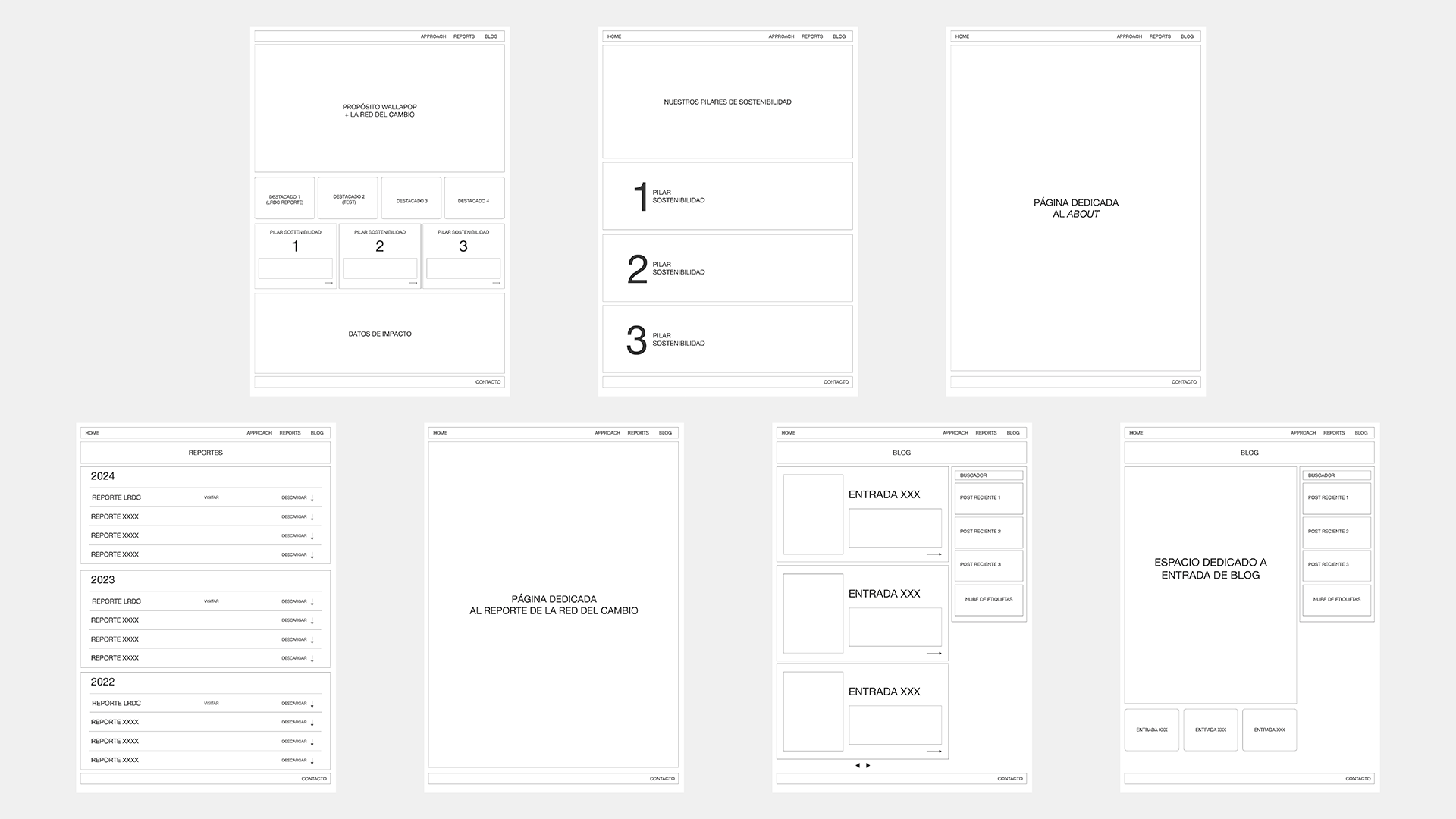
This meant that the website had to balance two things. On one side, it needed to communicate Wallapop’s sustainability work in a way that felt approachable and engaging. On the other, it had to function as a reliable source of information where reports, data and research could be easily accessed.

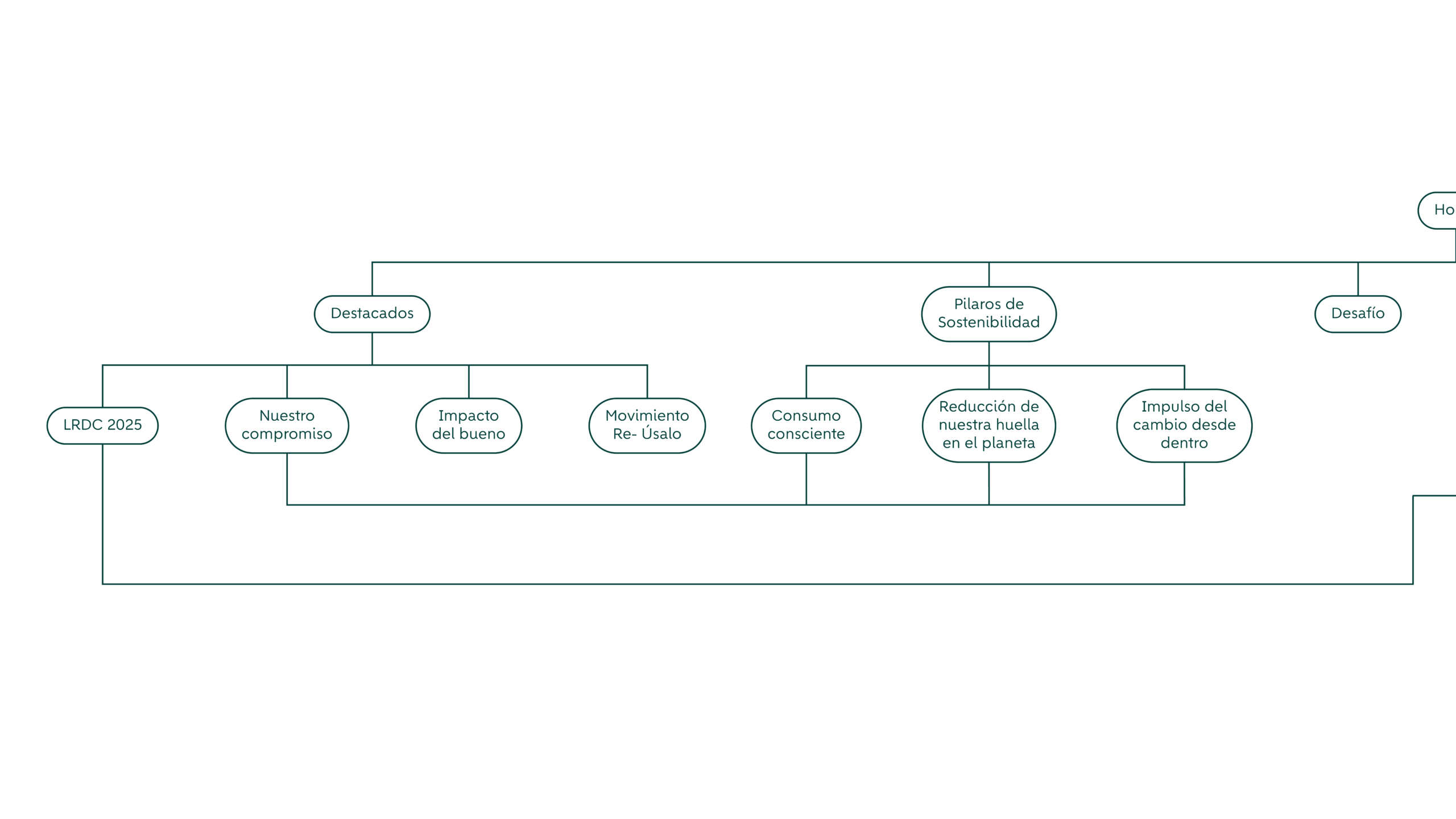
To respond to this, the structure of the website was designed as a clear narrative journey. The homepage introduces the broader idea of circular consumption and the role of the community, while the rest of the site expands this story through dedicated sections that explain the company’s approach and publish the results of its studies.

The site had to work both as an inspirational narrative and as a structured information platform.

One of the first steps in the design process was organising the information architecture of the site. Sustainability reports and research studies usually contain a large amount of information, so the challenge was to present this content in a way that felt clear and accessible without overwhelming the reader.

To solve this, the website was structured around a small number of main sections that guide the user through the different layers of content. The homepage introduces the sustainability narrative, highlights key initiatives and directs visitors to deeper pages where Wallapop’s approach and research can be explored in more detail.

Instead of treating the website as a traditional corporate page, the design was approached as an editorial system. Content is organised in modular sections that combine short explanations with strong visual elements, helping readers move through complex information more easily.

Another important decision in the visual direction was the type of imagery used across the website. While product photography is present in some sections, the visual language focuses mainly on people. The intention was to reinforce the idea that circular consumption is not only about objects changing hands, but about communities participating in a different way of consuming.

Circular consumption becomes more tangible when the focus shifts from objects to people.

Images therefore show everyday moments where people interact with objects, spaces and each other. This human perspective helps connect the data presented in the reports with real life situations, making the narrative feel closer and more relatable.

Product images still appear throughout the site, but they play a secondary role within the overall visual composition.

One of the key requirements of the project was that the website should continue evolving over time. New editions of the sustainability studies would be published regularly, so the platform needed a structure that could host them in a clear and organised way.

For this reason, the reports section was designed as a structured archive where documents are grouped by year and can be easily downloaded or explored online. This allows the site to function not only as a communication tool, but also as a growing repository of sustainability knowledge generated by the company, while making it easier for different teams inside Wallapop to update the content without affecting the overall design system.

The visual identity of the site follows Wallapop’s brand guidelines while adapting them to a more editorial digital environment.

Typography plays a central role in this system. Clear hierarchies and well-balanced text styles help organise complex sustainability content, making reports, insights and research easier to read and navigate. Color is used in a restrained and intentional way. The palette remains consistent with Wallapop’s brand, while softer tones help create a calm reading experience that supports long-form content.

Together, create a clean and contemporary interface that allows large amounts of information to feel approachable rather than overwhelming.

By combining editorial layout principles with a clear navigation structure and strong visual rhythm, the site helps transform dense information into something easier to read and understand.

The project works as a living archive that will continue growing with every new edition.