Inspired by symbolic interpretations of samurai culture, the project follows three anthropomorphic guardians, each representing a different form of inner strength.
The universe expands across 3D design, illustration, and collectible development. It is built as a visual system, not just as individual characters.
Seijaku no Shugo is formed by three guardians. Each one represents a different role within the system of balance.
They were designed to function together. Their silhouettes are distinct, but their proportions, material logic and visual weight are aligned to create unity.
Each character was developed through clear and structured stages.
The first sketches focused on defining the overall shape and key elements, especially the weapons and distinctive objects. At this stage, the goal was clarity of form and recognisable silhouettes.
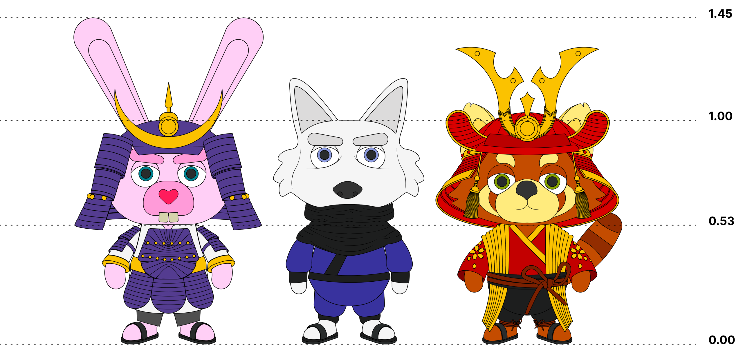
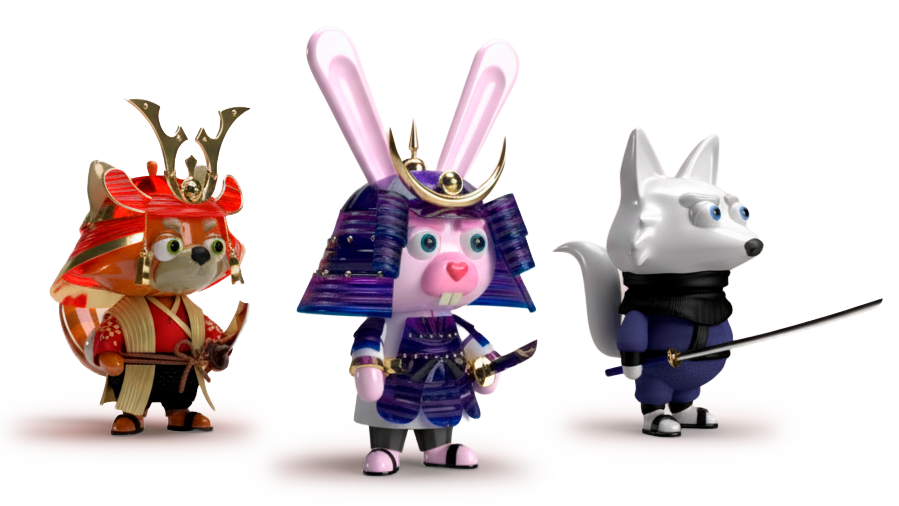
The clay style 3D models were used to study proportions and hierarchy. Without textures or materials, the focus shifted to pure modeling. This allowed each element to stand out through shape, scale, and volume rather than surface detail.
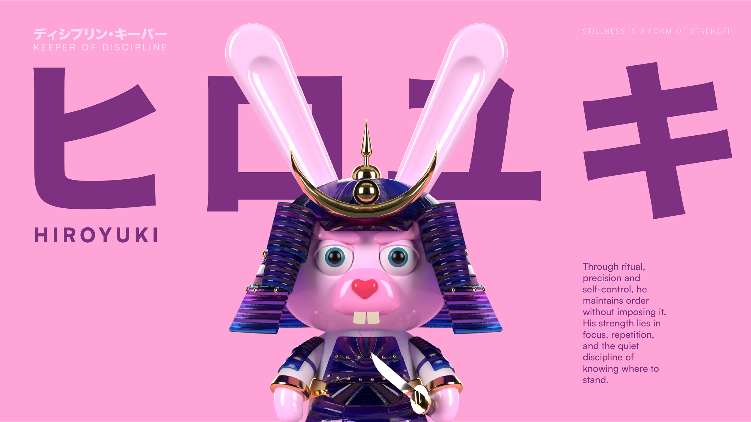
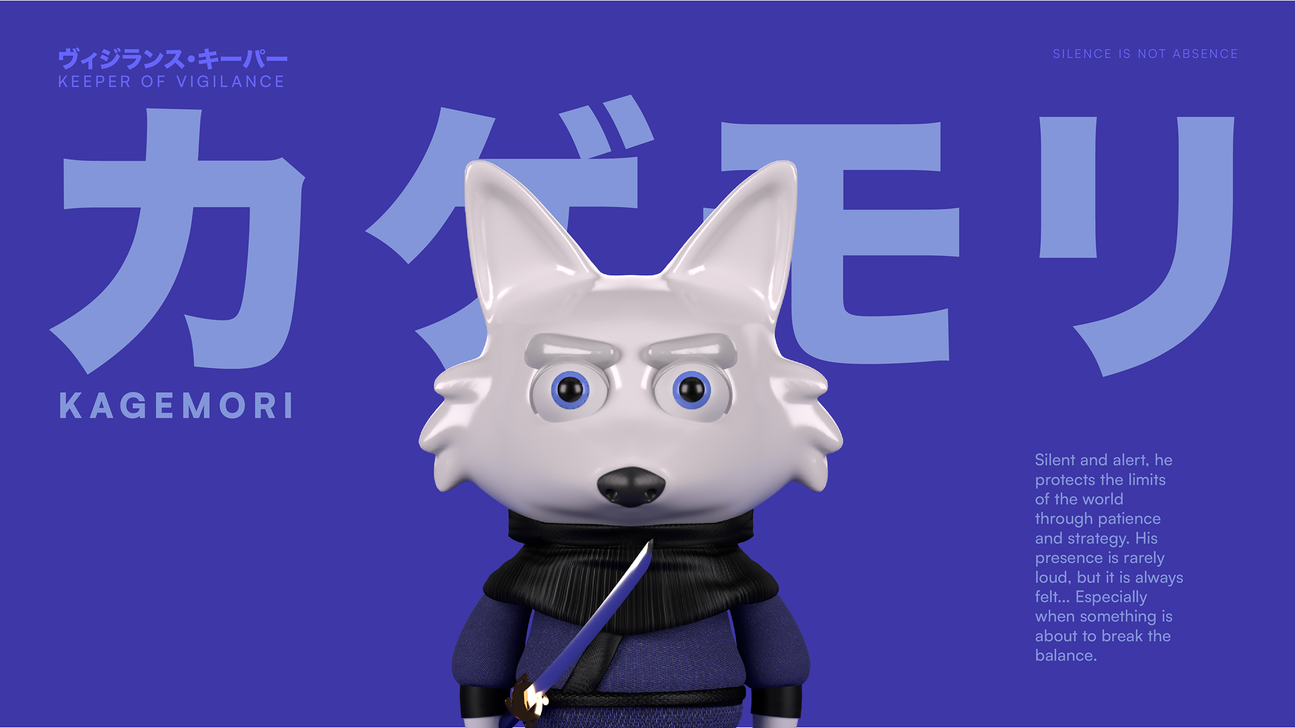
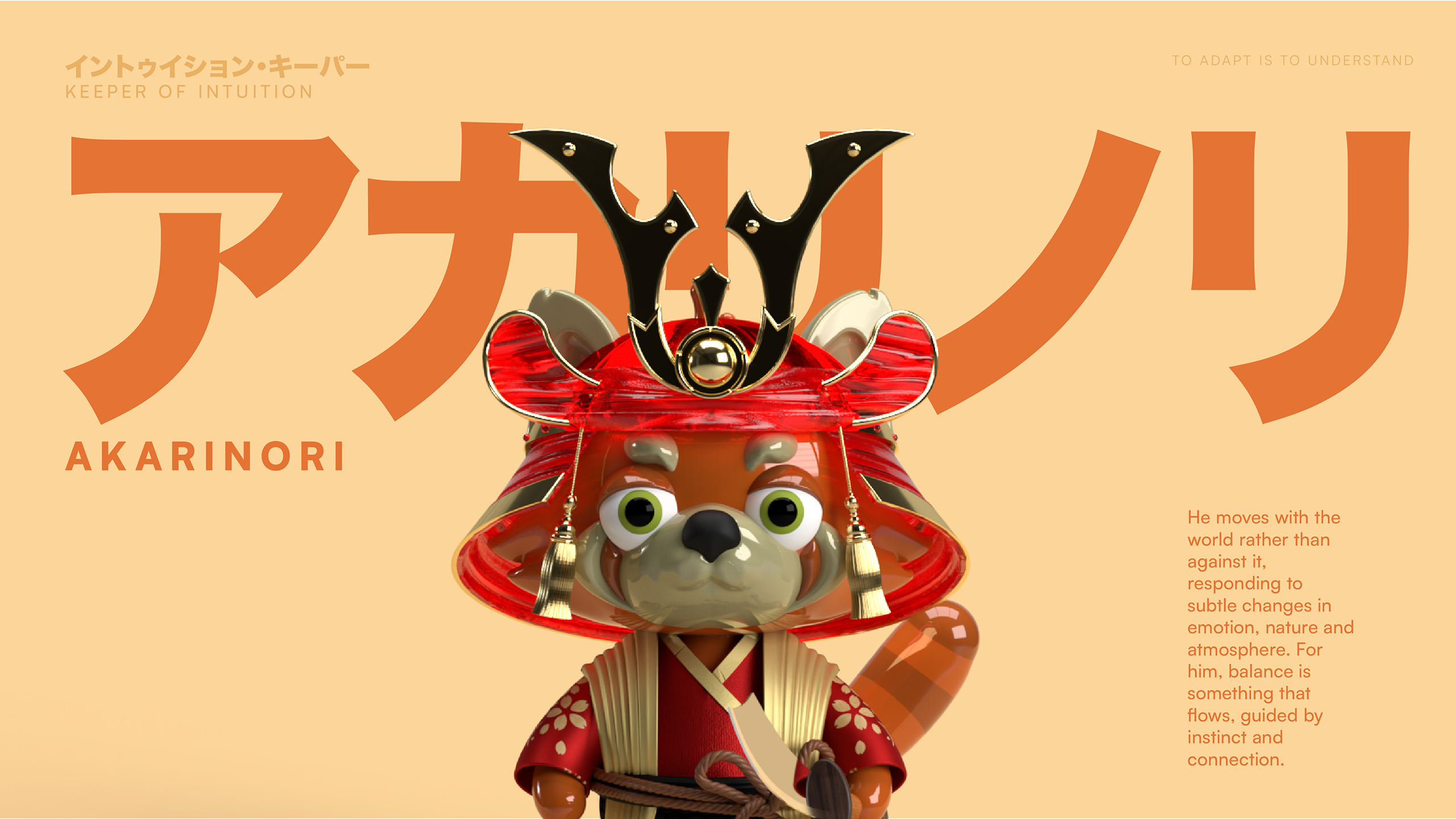
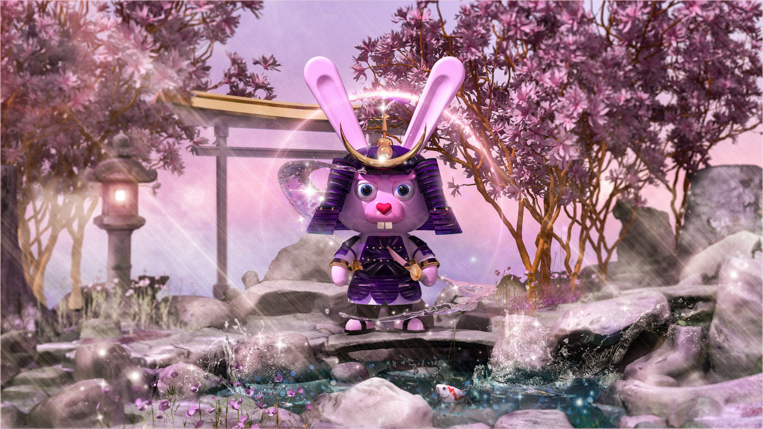
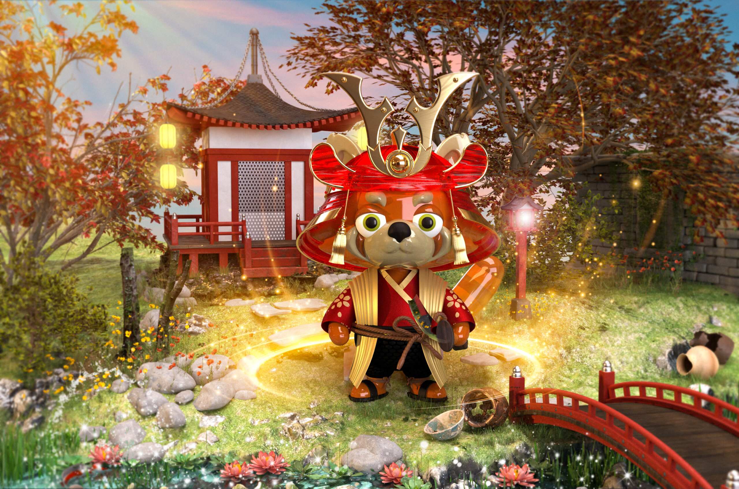
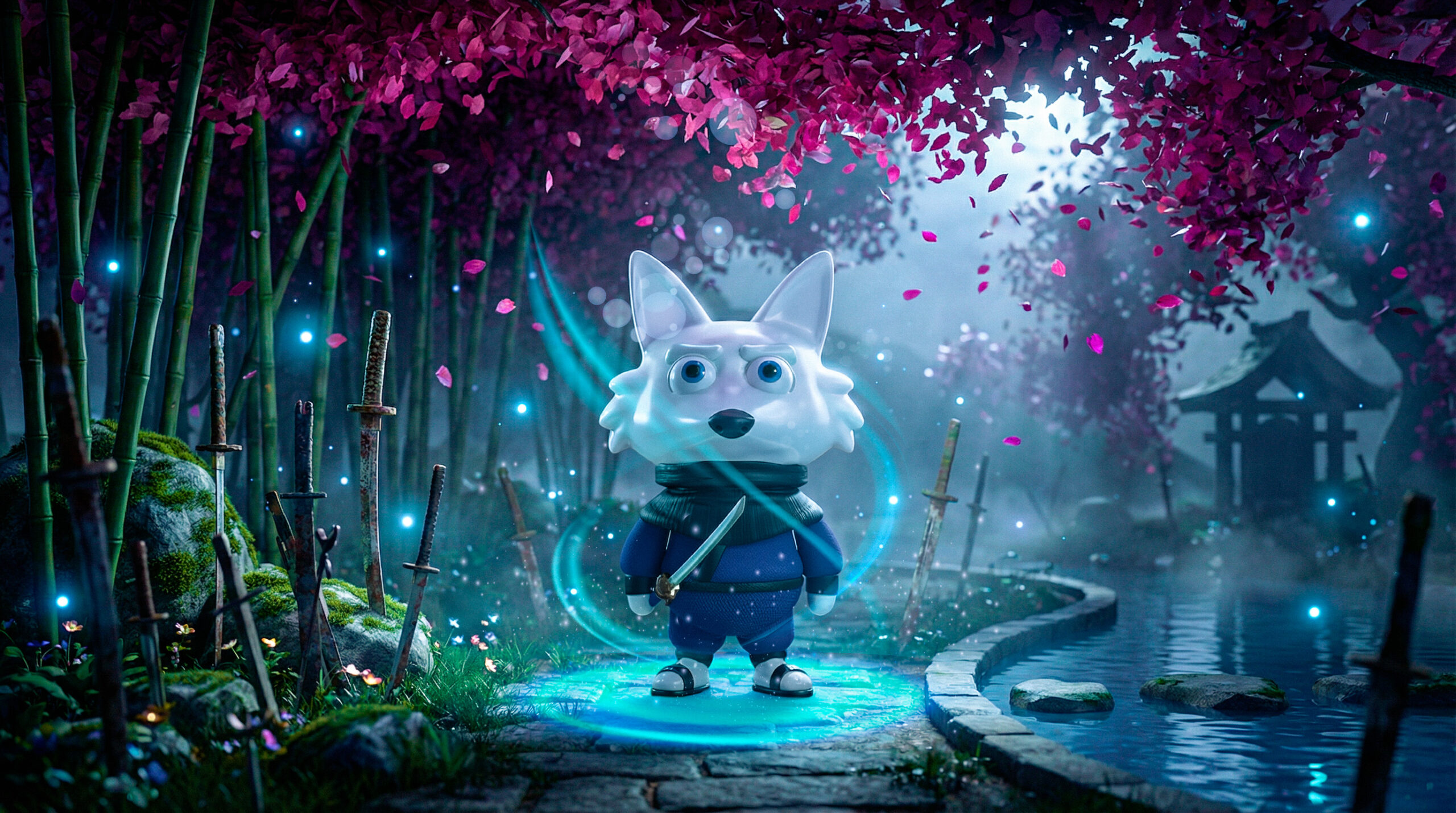
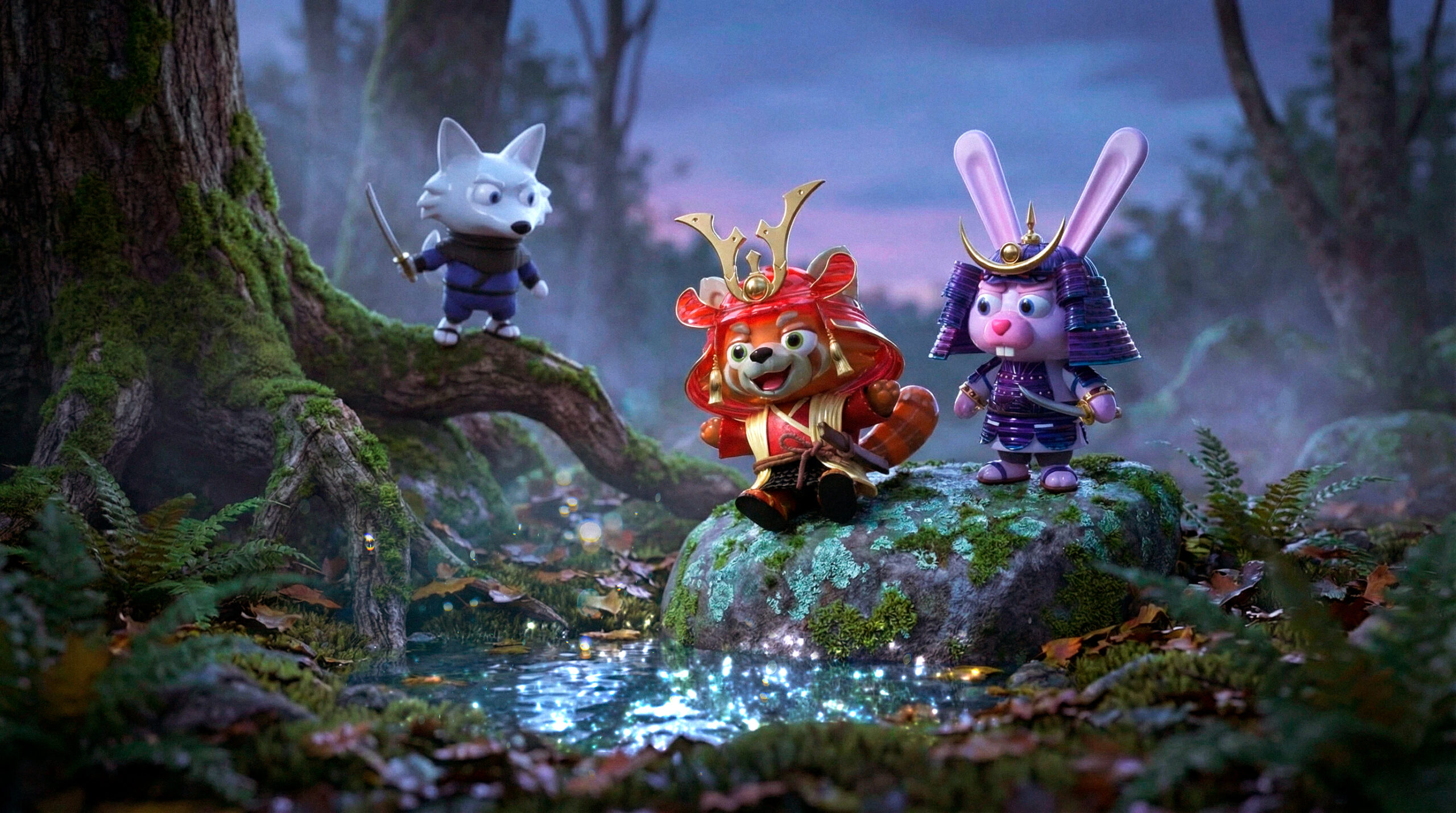
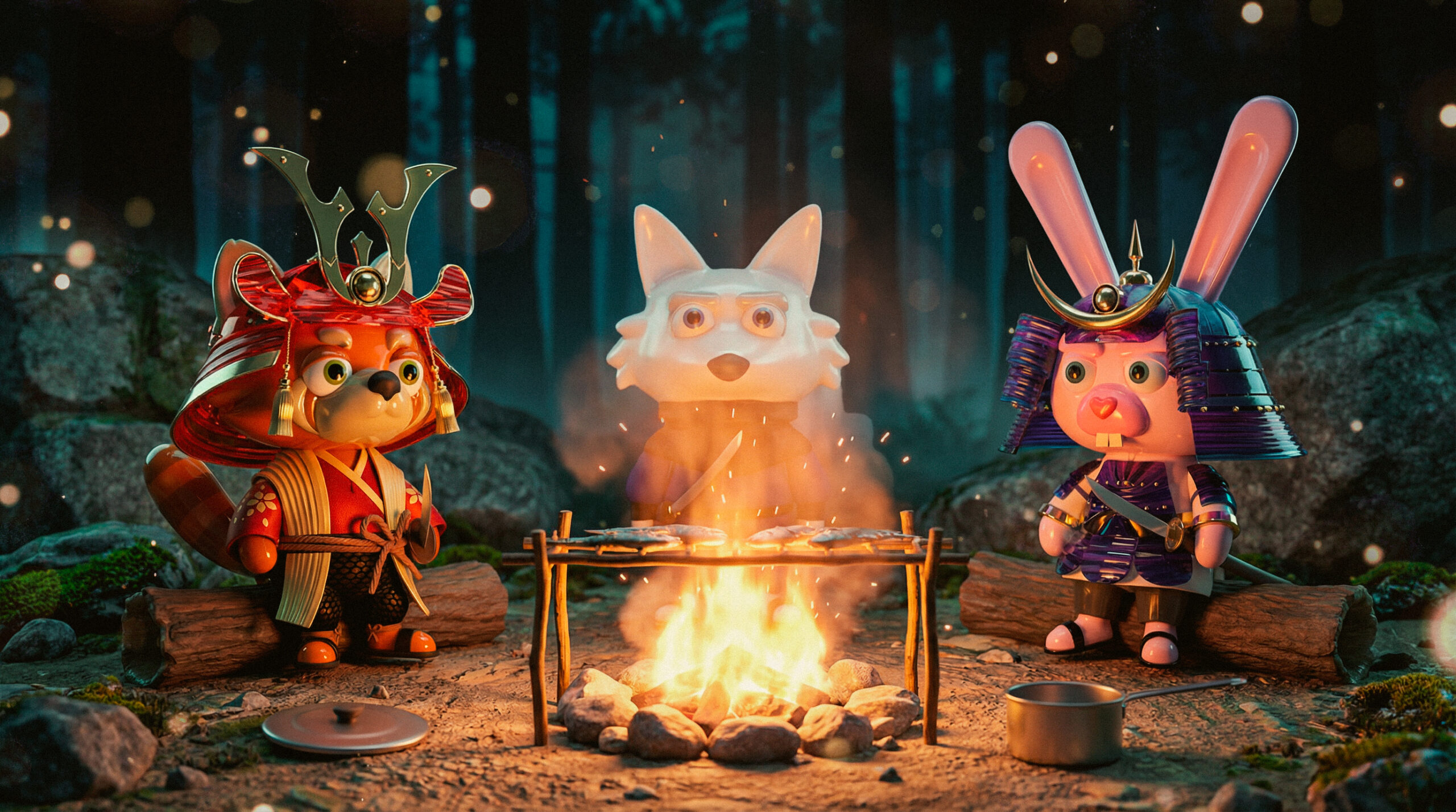
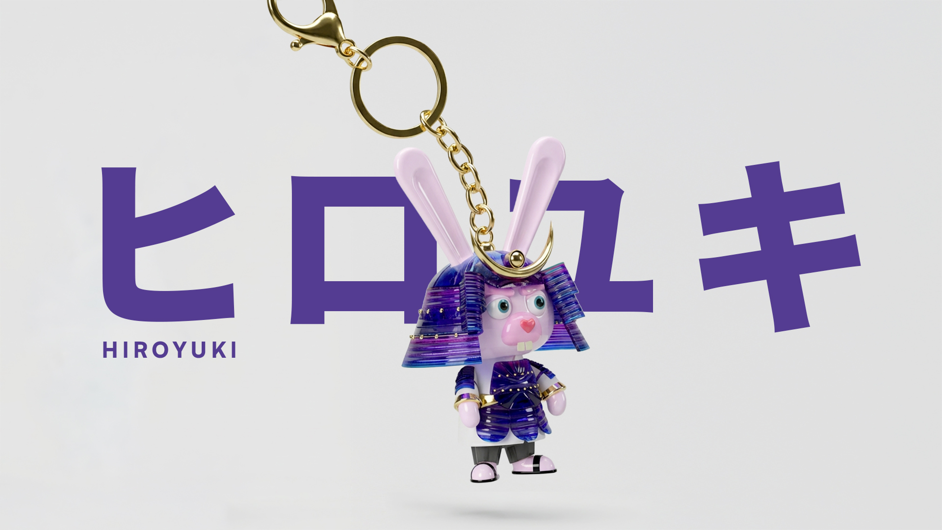
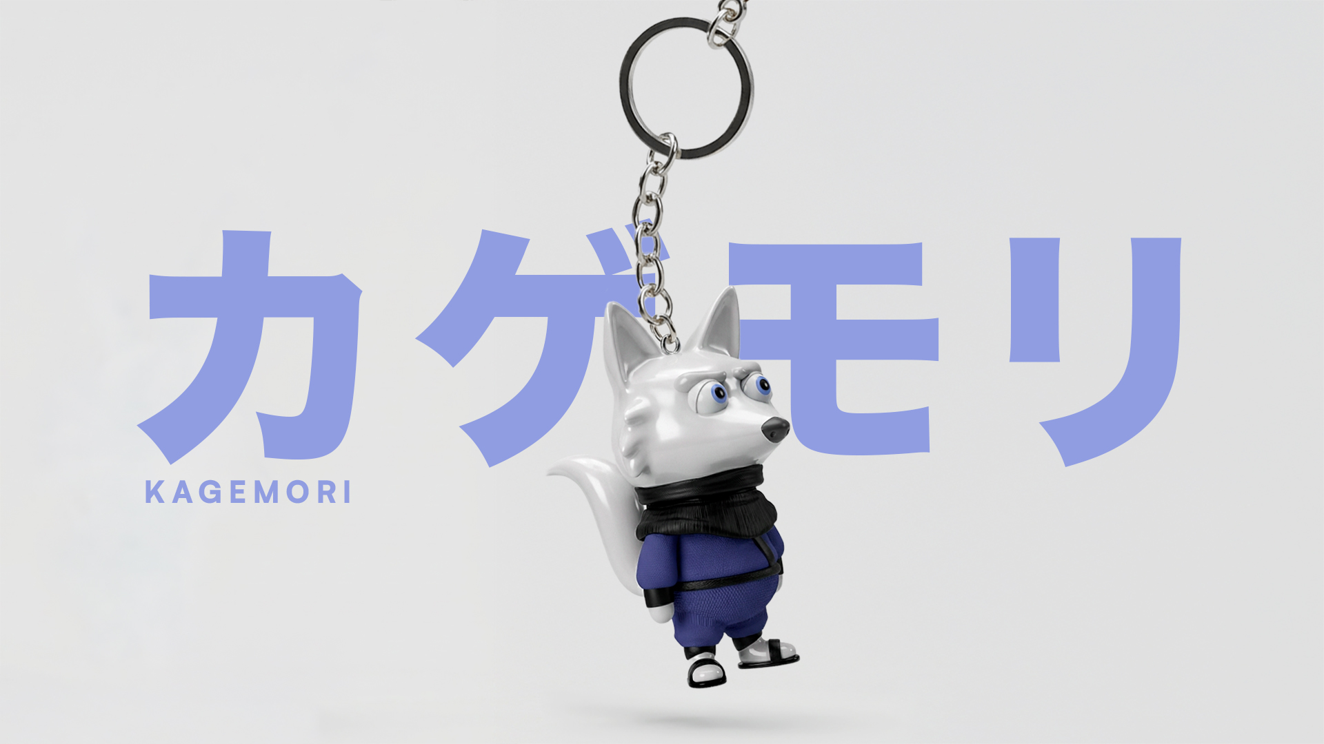
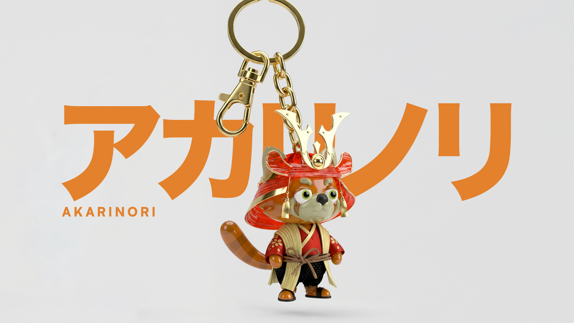
Once proportions and visual balance were resolved, the final 3D models introduced materials and rendering, translating the study into finished characters.
A proportional hierarchy was defined to establish visual balance between the characters.
Each variation in scale supports the personality of the guardian while maintaining overall cohesion within the group.
Color communicates energy, intention, and presence. Hiroyuki’s pink and purple tones express discipline and ritual through contrast and precision. Kagemori’s deep blues reinforce vigilance and control. Akarinori’s warm reds and oranges suggest intuition and movement.
These primary tones remain consistent across all formats. This consistency protects visual recognition and strengthens the cohesion of the universe as a whole.


The environments were designed to support and frame the characters within the universe. Each scene positions the guardian as the focal point through controlled scale, depth, and composition, avoiding unnecessary visual noise.
Lighting helps separate foreground and background, enhancing readability and atmosphere without prioritizing realism.
These spaces are integrated into the system, strengthening the visual identity of the project and expanding the world beyond the characters themselves.
When the three guardians appear together, the visual structure shifts from individual identity to collective balance.
Contrast becomes functional. Differences in height, silhouette, and color create rhythm within the frame and prevent visual flatness. The group composition introduces direction and movement, allowing the eye to travel naturally across the scene.
Their interaction defines hierarchy without needing emphasis. Placement, spacing, and orientation determine focus in a subtle and controlled way.
Together, they operate as a single unit. The system becomes visible through contrast, alignment, and shared proportion.
Keychain adaptations translate each guardian into a soft collectible format while preserving silhouette and color logic.


The project demonstrates how structured design, proportion control, and consistent visual language can support expansion across formats without losing clarity. It operates as an adaptable universe with long-term potential.